Get new insights with fast and easy analyses

Single Facility Assessment

Responsible for just one building? We can show how you compare to your nearest competitors. If you're part of a chain, we can also compare how you're doing relative to the rest of the facilities in your group.

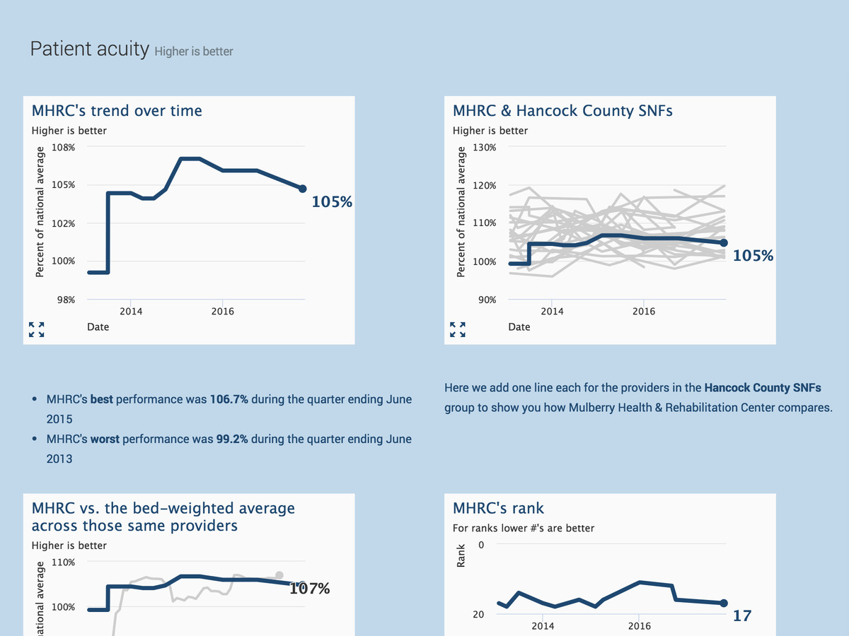
When plotting a facility against a group, we show the individual performance of each member of the group. You can view outliers as well as general performance trends.

In the tabular comparison reports, we show the rate of incidence for each Quality Metric and translate it into a count of residents affected. We show that data versus the state average for the facility as well as any group you choose. We make it easy to see where you're doing better (or worse) than the groups you're comparing yourself to.

Each analysis has great potential for growing your presence. Share insights with discharge planners, ACO representatives, physicians, your staff, & potential residents.
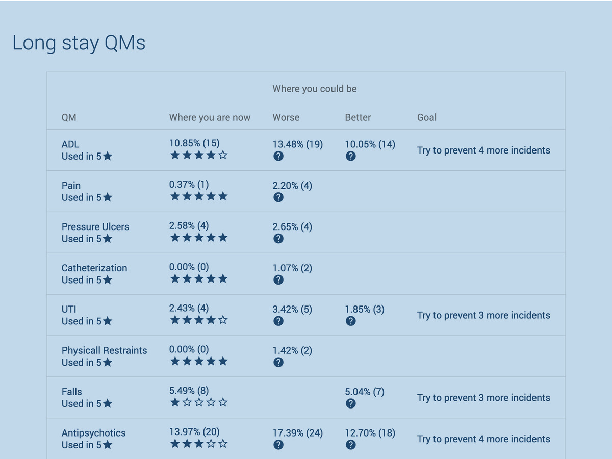
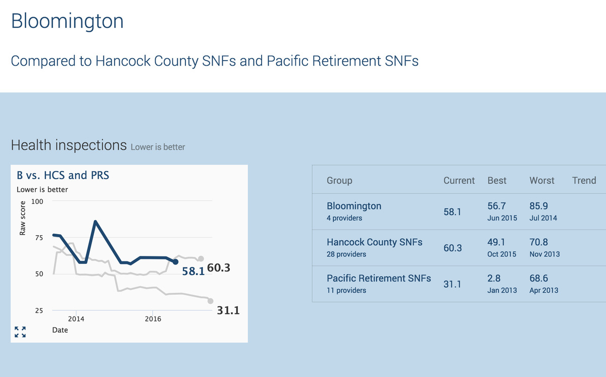
Table of quality metrics

Group Comparisons

With just the click of a button, we can help identify systemic issues among a group of providers. The group comparison function makes it easy to find positive outliers whose performance should be copied as well as those in need of more serious intervention.

Compare the aggregate performance of one group of providers versus another. Compare your chain versus the entire state or an arbitrary set of providers. If you work at an ACO and have providers managed by different companies, compare their performance against each other.

Compare groups of providers

Interactive Analyses

The analyses below are available without data entry on your part and updated monthly when CMS releases new data.

Analysis nameDescriptionSingle providerGroup of providersCompare against groups of providers
Management tools — software that helps decide what to do in facilities you manage.
Quality improvement planHelps you easily find which QMs to focus on for QAPI.check
Staffing improvement planSee what it costs to achieve different staffing stars.check
Line plots — Comparisons through time.
Five starShows the major 5 star components.checkcheckcheck
Long stay QMsShows the long term QMs. Both those that go into the 5 star rating and the others collected.checkcheckcheck
Short stay QMsShows the short term QMs. Both those that go into the 5 star rating and the others collected.checkcheckcheck
Staffing & AcuityShows Total, RN, LPN, & CNA HPRD comparison; Average patient acuitycheckcheckcheck
Tables — Comparisons with latest data.
Summary reportShows the stars and occupancy for a provider or group.checkcheck
QM detailShows what you need to do to move up a star for each QM.checkcheck
QM hotspotsShows QMs where you perform worse than state averages.check checkcheck
QM points of prideShows QMs where you perform better than state averages.checkcheckcheck

Proprietary Metrics

Using reported staffing hours plus the CMS's adjustments, we can calculate a provider's average patient acuity. That’s available today.

We're working on additional metrics that incorporate reimbursements, staff utilization, and claims data. If there's something you need today, get in touch at [email protected] and we'll see if we can help.

Plot of acuity through time

Find & compare nursing homes.
In a new way, today.